1. 데이터 읽기
- 필요한 라이브러리 import
import numpy as np
import pandas as pd
import matplotlib.pyplot as plt
import seaborn as sns
- pandas의 read_csv를 이용하여 dataframe 형태로 데이터 읽기
df = pd.read_csv('file path')- 상위 5개의 데이터 출력 : head()
df.head()- dataframe 정보를 요약하여 출력 : info()
df.info()2. 데이터 정제 및 전처리
결측값(missing data), 이상치(outlier)를 처리하는 데이터 정제 과정을 수행함
- column 지우기 : drop()
df = df.drop(columns = ['column name1', 'column name2', ...])
- 월별, 일별 분석이 필요한 경우 문자열 형식의 데이터를 나누어 숫자 형 데이터로 변환(month, day)
month = []
day = []

for data in df['date']:
	month.append(data.split('.')[0])
    day.append(data.split('.')[1])
- month와 day를 dataframe에 추가
df['month'] = month
df['day'] = day

df['month'].astype('int64')
df['day'].astype('int64')
3. 데이터 시각화
3.1. 월별/일별 수 시각화
- 전처리 단계에서 생성된 month 데이터를 바탕으로, 월별 확진자 수를 막대 그래프로 출력
- seaborn의 countplot 함수를 사용하여 출력
order = []  # 그래프에서 x축의 순서를 정리하기 위해 order list 생성
for i in range(1, 11):
	order.append(str(i))

# order / ['1', '2', '3', '4', '5', '6', '7', '8', '9', '10']

# 그래프의 사이즈 조절
plt.figure(figsize=(10, 5))

# seaborn의 countplot 함수를 사용하여 출력
sns.set(style='darkgrid')
ax = sns.countplot(x='month', data=df, palette='Set 2', order=order)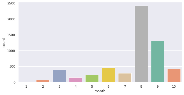
- series의 plot 함수를 사용해서 출력도 가능
- value_counts()는 각 데이터를 세어서 내림차순으로 정리하는 함수
df['month'].value_counts().plot(kind='bar')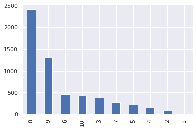
- 특정 월의 일별 확진자 수 막대그래프로 출력해보기
day_order = []
for i in range(1, 32):
	day_order.append(str(i))
- 월별과 마찬가지로 seaborn의 countplot 함수를 사용하여 출력
plt.figure(figsize=(20,10))
sns.set(style="darkgrid")
ax = sns.countplot(x="day", data=df[df['month'] == '8'], palette="rocket_r", order=day_order)
- 특정 월의 평균 일별 확진자 수를 구하기
df[df['month'] == '8']['day'].count() / 31

# 다음과 같이도 가능
df[df['month'] == '8']['day'].value_counts().mean()
3.2. 지역별 수 시각화
- '지역' 데이터 확인 후 이상치 데이터 처리
df['area']

df = df.replace({'종랑구':'중랑구', '한국':'기타'})
- 지역별로 막대 그래프 출력
sns.set(font='Font name',
	rc={'axes.unicode_minus':False},
        style='darkgrid')

ax = sns.countplot(x='area', data=df, palette='Set 2')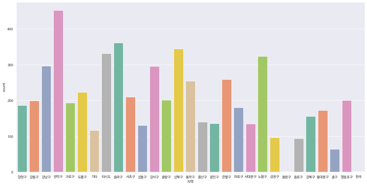
- 특정 달에 지역별로 확진자가 어떻게 분포되어 있는지 확인하기
df[df['month'] == '8']

# 8월에 확진자가 가장 많이 나온 지역 알아보기
df[df['month'] == '8']['area'].value_counts()
df[df['month'] == '8']['area'].value_counts().index[0]
- 그래프 출력하기
plt.figure(figsize=(20,10),
		rc={'axes.unicode_minus':False},
        	style='darkgrid')

ax = sns.countplot(x='area', data=df[df['month'] == '8'], palette='Set 2')
- 특정 지역 내 확진자 수가 월별로 어떻게 증가했는지 분포 확인
df['month'][df['지역'] == '동안구']
- 그래프 출력하기
plt.figure(figsize=(10,5))
sns.set(style='darkgrid')

ax = sns.countplot(x='month', data=df[df['area'] == '동안구'], palette='Set 2', order=order)
3.3. 확진자를 지도에 출력
- 지도를 출력하기 위해 folium 라이브러리 사용
import folium- Map 함수를 이용하여 지도 출력
map_seoul = folium.Map(location=[37.529622, 126.984307], zoom_start=11)- 지역마다 지도에 정보를 출력하기 위해서는 각 지역의 좌표 정보 필요
'데이터 사이언스 > 데이터 분석' 카테고리의 다른 글
| [NIPA AI 교육/기본] 데이터 분석하기(3) (0) | 2021.08.20 |
|---|---|
| [NIPA AI 교육] 데이터 분석하기(2) (0) | 2021.08.18 |
| Matplotlib 기초 (0) | 2021.08.12 |
| [NIPA AI 교육/기본] Pandas 분석용 함수 - 집계함수 (0) | 2021.08.11 |
| [NIPA AI 교육/기본] Pandas 기초 (0) | 2021.07.26 |
